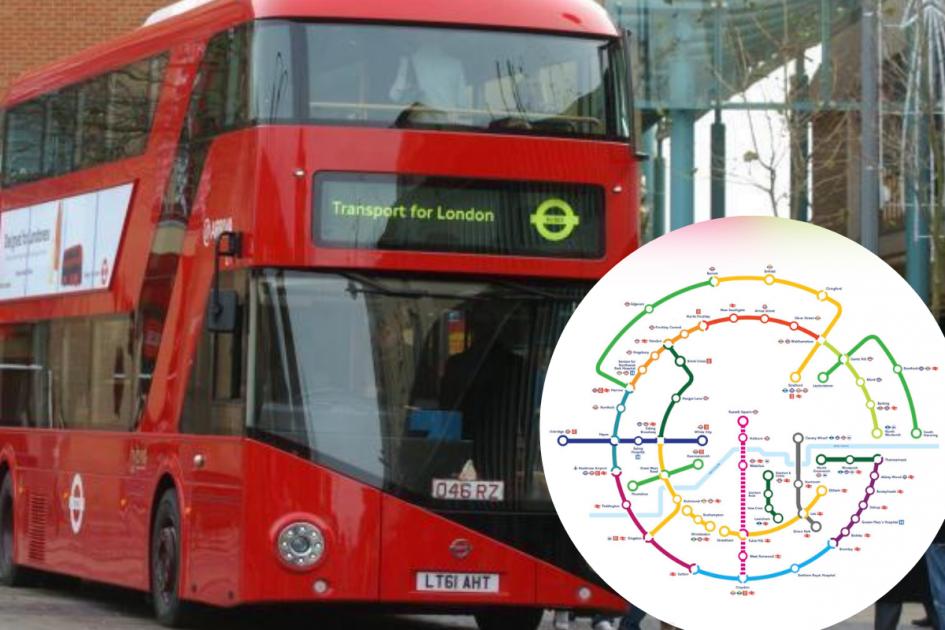
Harry Beck is the undisputed master of the tube map. In 1933 he changed the transport world – and, arguably, the design world, too – with his geometrically laid out map of the London Underground network.
(Photo by Marco Mariani/Shutterstock)
Whereas all previous maps had been geographical representations of London, with the lines drawn between the stations’ actual locations, Beck understood that the above-surface geography cluttered the picture, providing the transport with unnecessary information that needlessly complicated a journey.
So he just eradicated it. Instead, he designed a clean, clear, crisp map. Each line charted a course of straight lines wherever possible, with interchanges between lines shown as hollow geometric diamonds, and the snaking of the Thames providing the only meaningful geographical marker.
The principles that guided his first map still govern the Underground network today, and have been adopted (often very closely) by almost every urban transport network in the world.
Much of his map is familiar to us, particularly in terms of colours and the basis of the network, which was reasonably well established by the 1930s.
The Metropolitan line floats off into the top left-hand corner of the map in a deep purple, as it does today. The District line dominates the western stretch of the River Thames in its snaking green, and pushes out east from Whitechapel into the ether.
The Northern line straddles central London, with its two branches through Bank and Charing Cross in the black that we still use today. The Piccadilly runs in a deep blue U-shape from South Harrow to Cockfosters.
But other aspects are less familiar.
Content from our partners


The Central line is a Trump-esque orange, and the Bakerloo, running all the way to Watford Junction, is in Central line red.
Weird, huh?
But the offensively wrong colours didn’t last long. By 1938, the Central line was in today’s red, and the Bakerloo line – the brown line – had taken on its right and proper hue.
Before introducing the lines that have been built or introduced since, however, it’s worth peering a little further back.
The earliest tube maps
One of the first tube maps you can find online these days is from 1908. And for today’s tube users, it is entirely horrifying.
The District line is still green, sure, and the Northern line (then only from South London to Euston via Bank) is black. Other than that, pretty much everything is wrong.
The Charing Cross branch of today’s Northern line, from Charing Cross to Highgate and Golders Green, is a deep greyish blue, and today’s Piccadilly (from Hammersmith to Finsbury Park) is a putrid yellow.
The Metropolitan Railway is in red, and – most horrifyingly of all – the Central line is in Victoria line blue.
Weirdly, though, the Bakerloo (then running only from Edgware Road to Elephant and Castle) is brown. Despite the fact it would later stop being brown, for a bit.
Fixing the palette
The District line is the most colour-stable of them all. In every map I’ve seen – and that’s an awful lot of maps – it’s coloured green.
While there’s no set established historical reason for this, it doesn’t take a genius to figure that it’s one of the primary colours (of light, if not of paint), and therefore a good choice. It’s also nicely emblematic of the leafy pastures of the pleasant west London suburbs from which it brought commuters to the centre of the gritty city.
The District line also has a lot of green on it. Though now only Turnham Green and Parsons Green survive, Fulham Broadway used to be called Walham Green. And with Chiswick Park, Wimbledon Park, Southfields, and Kew Gardens all along the line, it’s all pretty… green-sounding.
The Metropolitan line has stayed resolutely purple since the first Beck map in 1933. It’s a similar colour in this rather overly artistic map from 1921.
Again, there’s no historical decree as to why purple was the anointed hue, but many of the Metropolitan Railway’s locomotives – in its steam days – were painted purple. So it’s likely that the private railway company, as it was in those days, used purple as a company livery of sorts. This then got transferred over to the line when it became part of the wider London Underground network.
Plus, it contrasts pretty nicely with the green of the District line, which helps tell the two apart – especially as, in the early days of the underground, they spent a lot of time jostling against one another, both figuratively and literally.
[Read more: Why is London’s Tube so hot?]
The City and South London Railway was the first deep-level tube line to open, and was also the first electric railway in England, opened by the Prince of Wales (Edward VII) in 1890. The fact it was the deepest, darkest line seems as good an explanation as any for why today’s Northern line is black.
The Piccadilly line is also one of the oldest, which is why it was also gifted with a primary colour – blue. The 1920s seems to be when the Piccadilly and Central made the switch, with Piccadilly taking over a mid-blue that would later shift to our current dark blue, and Central occupying the hearty red we have today. Beck’s first map is a bit of a blip for the Central line.
The Circle line is an early entry to the map, and given its proximity to the Metropolitan and District lines was an obvious choice for yellow – it contrasts well with both, helping the visibility of the lines on the map, and making it much more intuitive for passengers.
As mentioned earlier, Bakerloo flirted with various colours before settling on brown. Perhaps that just made alliterative sense.
More interesting are the newer lines. Despite the fact that Queen Victoria’s favourite colour was almost certainly purple, the ’60s-built line is a light blue. This, if you look at the other colours already in use, seems a logical distinction – but it did mean that the Piccadilly line’s darker hue had to be formalised as a darker blue, rather than the mid-blue used in some of Beck’s maps.
The Jubilee line, carved out of a branch of the Bakerloo with an extension to Charing Cross in the 1970s, has the most definitive story behind its colour.
Originally intended to be called the Fleet line – as it was supposed to have connected north-west with south-east London over the subterranean River Fleet – the planned colour was a steely grey to make a clever pun on fleet, the river, and fleet, as in ships.
But when the Queen’s Silver Jubilee came around, and the Conservatives won the Greater London Council election of 1977, the line was renamed the Jubilee Line. The colour was accordingly adjusted – with just a few shades of lightening, it transformed from a steely, Labour, hardworking sort of grey to a bougie, Conservative, metro-liberal-elite sort of silver. Or something.
The last formal entry to the tube map before the Elizabeth line, the Hammersmith & City line, came along in 1990 and rather aptly demonstrates the problem of having too many lines: it’s salmon pink.
But having said that, it works. It contrasts enough with the lines that it straddles from Barking to Hammersmith, and doesn’t really come into enough contact with the lines it might clash with – namely, the Central – for that to be a problem.
Essentially, the tube map is a hodge-podge of colours that accidentally fell into place over decades, many of them for no good reason, and are now so resolutely stuck that changing one would probably incite a revolution.
[Read more: How Crossrail is affecting house prices in London’s suburbs and commuter towns]
https://citymonitor.ai/transport/metros/how-did-tube-lines-get-their-colours-3026


