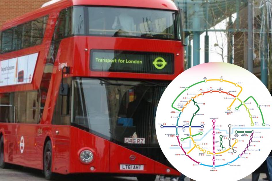
Tourists and Londoners alike are going crazy over an alternative London Underground map which shows the exact geographical locations of each tube and overground station. The map is helping people to understand exactly where each station is in comparison to the usual map which was called a “maze” by confused tourists.
Available online, the interactive map caused a stir on social media. The map website, which is predominantly used to map the French tube lines, was made to mirror the actual layout of lines across the capital. Greater London is served by 11 Tube lines, along with the Docklands Light Railway, the London Overground and National Rail services. Each stop is placed on a detailed extract which has been viewed thousands of times by those wishing to get a better understanding of London’s network. The map can be viewed here.
According to the Transport for London website the original map was devised in 1933 by Harry Beck. The website adds: “The London Underground map is a 20th-century design classic. It’s useful and clearly indicates the general directions used to designate trains (north, south, east or westbound), with all interchanges clearly shown.” In contrast, Londoners and tourists both believe the standard map wasn’t as clear as TFL said.
READ MORE: Crossrail 2 and new London Underground stations: London’s major transport projects we could see by 2050 and how likely it is they’ll actually happen
The map shows a detailed view of Stratford station and each different line that runs through it
(Image: CartoMetro)
One person who was amazed by the interactive map said: “Wow this is exactly what we needed after having to look at the maze that is the London Underground map usually.”
Another person said: “That’s a great map and is easy to understand, it’s surely too big to be used anywhere else though as it has to be zoomed in?” The map was introduced to the Quora platform by a man who called it “revolutionary”.
A tourist joined the conversation and said: “This would have been so useful to see when I first visited London. It’s great, you do have to zoom in though which means it can’t really be printed.”
Finally, one man said: “It’s a great map and I want to make it pocketable so everyone can understand it more. Why on the actual Tube map are sections not labelled North, South, East and West London? It would really help.”
Do you wish to share a story? Contact [email protected]
Want more from MyLondon? Sign up to our daily newsletters for all the latest and greatest from across London here.
Read More
Related Articles
Read More
Related Articles
https://www.mylondon.news/news/zone-1-news/people-going-crazy-alternative-london-23641831


